

You are here: Nature Science Photography – Lightness and color – Lightness and color in photography
In image composition, we can use the properties of the two perceptual channels described above to capture images that particularly appeal to the viewer. To do this, it is necessary to stimulate his attention by stimulating the first and very quickly appealing where-system. The elements known in classical image design as achromatic components serve this purpose. These are:
Lines - straight, but at different angles to each other
Object shapes and forms - two-dimensional as silhouettes, three-dimensional through lateral illumination
High-contrast surface textures - especially emphasized by illumination coming from the side
Patterns - the deliberately ordered repetition of the previously mentioned elements
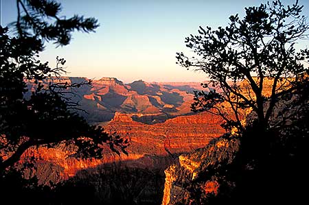
High-contrast, clear object edges, lines, shapes, angles, and the suggestion of spatial depth are important landmarks in our visual system’s ability to recognize and differentiate objects. Figure 55
(Photo where-system) builds primarily on the aforementioned design features. Try to notice where your gaze wanders and lingers while viewing the image. The where-system quickly categorizes the image content, then loses interest and looks outside for new stimuli.

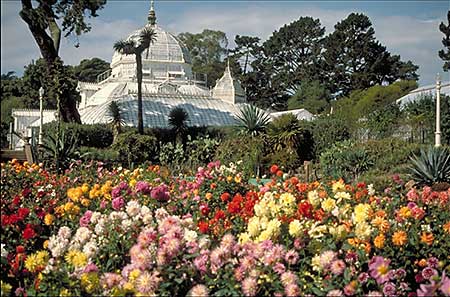
The viewer’s gaze is held by features that appeal to the intellectual what-system. These include:
Curved and bent lines
Low contrasts
A large number of details
Gradual tonal transitions
Colors
Figure 56 (Photo what system) makes use of these elements. Once you have directed your gaze to the image, which is certainly more difficult than with the first picture, it stays there longer, roams around, and examines everything closely because the what-channel reacts more slowly but more persistently. In this context, it is appropriate to mention color only as the last element. This is not intended to diminish its significance, but rather to appropriately place it within the hierarchy. Color is important, but it is not everything! Ansel Adams‘ grandiose landscapes, after all, have shown us beyond doubt that photography can convey strong feelings even without colors.
So the first picture is too where-oriented to hold the viewer’s attention for a long time, the second is too what-heavy to catch his attention easily and quickly. Only the combination of all characteristics triggers both perception channels, as shown in figure 57 (photo where- and what system) demonstrates. The contrasting edges and varied shapes draw the eye irresistibly into the picture, where it is reliably held by the varied textures, details and color.
Because the brightness values seen by the color-blind where-system do not enter our conscious perception but are previously combined with the color information of the what-system, it is difficult to visualize a scene as seen by the where-channel. Therefore, to better assess the effectiveness of a composition before shooting, you should view your color images in grayscale every now and then. The Lab color model’s luminance channel provides the most accurate color value conversion, closely matching our perception. B/W photography has always favored achromatic design features, and this could be the reason why these images are so satisfying to us and only a few viewers feel that the color is missing. – Because color, in the neurological sense, is just an addition!
Next Color contrasts
Main Lightness and Color
Previous Electronic image carriers and digital technology
If you found this post useful and want to support the continuation of my writing without intrusive advertising, please consider supporting. Your assistance goes towards helping make the content on this website even better. If you’d like to make a one-time ‘tip’ and buy me a coffee, I have a Ko-Fi page. Your support means a lot. Thank you!
 Since I started my first website in the year 2000, I’ve written and published ten books in the German language about photographing the amazing natural wonders of the American West, the details of our visual perception and its photography-related counterparts, and tried to shed some light on the immaterial concepts of quantum and chaos. Now all this material becomes freely accessible on this dedicated English website. I hope many of you find answers and inspiration there. My books are on