

You are here: Nature Science Photography – Visual acuity – Contour sharpness
How sharp, how clear and distinct the so finely rasterized object edges appear to us depends on the excitation state of the center/surround cells. Their output signal is the greater, the lower the inhibition in the cell edge, i.e., the greater the difference in brightness/contrast on the two sides of the object edge. Thus, it is time to take a closer look at this ominous type of ganglion cell. It is best to start with a practical example.
Consider figure 19 (Mach’s stripes). This shows a sequence of areas of different shades of gray that have no color gradation in themselves. However, you will undoubtedly observe that the individual stripes manifest as gradients from light to dark, with an increase in brightness at the borders. This effect is called Mach’s stripes after its discoverer (1865), the physicist and philosopher Ernst Mach, and it was unclear for a long time how they occur.

Figure 19: Mach’s stripes
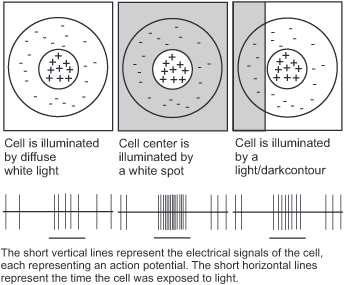
We owe Stephen Kuffler (1913-1980) the explanation and realization that vision is more than just transporting the retinal image to a location in the brain for viewing. His research provided evidence that vision is a process of information processing, for he discovered the first and most important step of this cascade in the 1950s. He recorded the activity of retinal ganglion cells and found that he could stimulate them to „fire“ with small points of light. Of course, it had been clear for a long time that the eye reacts to light, but Kuffler proceeded very systematically and realized that the smaller the irritating light spot, the better the cells reacted. From the fact that large dots were less effective than small ones, he concluded that the ganglion cells were not only excited by the light incident on the centers of their receptive fields but at the same time inhibited when light fell on the immediate vicinity of the centers (Kuffler 1953).
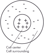
Figure 20: A retinal ganglion cell in center/surround organization. The plus and minus signs indicate which areas of its receptive field react to light and how.
This cell organization is called center/surround and is of fundamental importance for stimulus processing in the nervous system because it makes the cells sensitive to the interruptions of the light patterns in the retinal image (the edges and interfaces of the objects) and insensitive to changes in the absolute amount of light or its gradual change, both of which are of less importance. Many visual perceptions, such as brightness, color, motion, and spatial depth, rely on this center/surround organization.
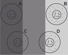
With the center/surround organization, Mach’s stripes can be explained on the basis of figure 21 (explanation Mach’s stripes) as follows: Cell A is least excited by the darkest stripe in comparison. The receptive field of cell B, on the other hand, falls on the brightest stripe, which excites it the most. The exciting receptive center of cell C falls entirely within the darkest first stripe, whereas its inhibiting receptive environment lies partially within the slightly brighter second stripe. For this reason, the environment triggers an inhibitory response, causing the cell to perceive a darker stripe compared to cells whose receptive fields are entirely within the same stripe, such as cell A. We see the opposite phenomenon in cell D. Its exciting center lies entirely in the third brightest stripe, while its inhibiting environment lies partly in the darker middle stripe. Here, too, the environment generates an inhibitory response, which this time makes the cell „see“ a brighter stripe than cell B.
Precisely, the contrast enhancement (that the inner edges appear darker and the outer edges lighter) at the borders between the individual stripes in figure 19 (Mach’s stripes) is due to the competition between cells whose receptive fields lie entirely within one stripe and those whose receptive fields lie partly in the other stripe. The perceived brightness gradients within the stripes are due to the fact that the cells are inhibited less and less by their surroundings with increasing distance to the edge and at some point not at all, thus creating a fine staircase.
Contour sharpness means the clarity of the object boundaries. The greater the contrast along the edges, the greater the sharpness.
Figure 22 (contrast enhancement) shows an example of how we can use the center/surround organization to increase the perceived sharpness by simply increasing the contrast at one edge. The light gray line on the left shows the direct transition to the dark gray background and is thus as sharp as the resolution allows. The right line, on the other hand, has a 1 pixel wide dark transition on the outside and a light transition, also 1 pixel wide, on the inside (see enlargement below). Despite the reduction in resolution and actual sharpness due to the wider transition area, the increased contrast enhances the perceived edge sharpness.

Next
Main Visual acuity
Previous The total resolving power of the visual system
If you found this post useful and want to support the continuation of my writing without intrusive advertising, please consider supporting. Your assistance goes towards helping make the content on this website even better. If you’d like to make a one-time ‘tip’ and buy me a coffee, I have a Ko-Fi page. Your support means a lot. Thank you!
 Since I started my first website in the year 2000, I’ve written and published ten books in the German language about photographing the amazing natural wonders of the American West, the details of our visual perception and its photography-related counterparts, and tried to shed some light on the immaterial concepts of quantum and chaos. Now all this material becomes freely accessible on this dedicated English website. I hope many of you find answers and inspiration there. My books are on