

You are here: Nature Science Photography – Lightness and color – The perception of lightness and color
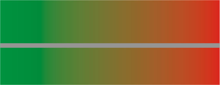
Take a look at figure18 (simultaneous contrast 1). Direct sunlight is the ideal setting for this. The gray stripe in the center is the same gray throughout. Do you notice a gradual change from a slightly reddish gray on the left to a slightly greenish gray on the right?
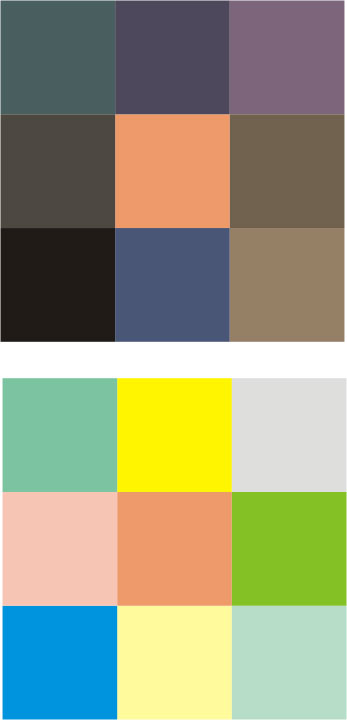
Another example. The two peach-colored squares in figure 19 (simultaneous contrast 2) actually have the same spectral properties. However, the square on the left, against a darker background, appears brighter than the one on the right, surrounded by lighter tones. Both effects are called simultaneous contrast and suggest that we are dealing here with a spatial contrast formation in the color channels which goes beyond the result of the simple opponent color cells described above and behaves quite similarly to the brightness channel.
And another one. Find an object of any uniform color in your dwelling and look at it once under the daylight coming through the window and then under the light of an incandescent lamp. The difference in lighting may cause a slight color change, but it will be significantly less than anticipated. After all, even more so than the light from the low sun, incandescent light contains a much greater proportion of long-wave (reddish) radiation than daylight.
In summary, we are dealing with two complexes in the examples given earlier: On the one hand, we perceive colors relatively depending on their environment, and on the other hand, we perceive them constantly regardless of the quality of the illumination – relatively constant, in other words.
„Relatively constant“ means that a) we perceive the colors of individual surfaces in relation to each other (relatively), and b) we almost completely disregard the intensity and spectral composition of the incident light. In this last sense, our perception yields constant results.
Both phenomena cannot be explained by the opponent color mechnanism alone, which is why it cannot be the final stage of color perception. Rather, the result is identical to the one we got to know in the previous section with the brightness values. The color information must therefore be processed at a higher level in the same way as the type 3 cells of the brightness channel do.
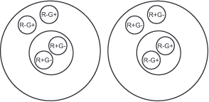
We currently lack a comprehensive understanding of the processes in the human brain that lead to the formation of spatial contrast in the color domain. However, animal experiments have discovered neurons, referred to as double opponent color cells, in the primary visual cortex of rhesus monkeys. These neurons appear well-suited to perform the theoretically required processing steps (9). These cells are one level above the simple opponent color cells in the hierarchy and compare the ratios between red and green as well as between yellow and blue not only for a point on the retina like these, but for a point and its surroundings and thus in a spatial dimension. Figure 22 (Double opponent color mechanism 3) illustrates this. They are also divided into center and periphery, but in them the values of many, for example, red + / green – opponent color cells are combined to an exciting impulse in the center, and against the inhibiting impulse, also many red – / green + opponent color cells are placed in the periphery.
With this model, we can explain the phenomena of relative color perception (of simultaneous contrast) and constant color perception, which at first seem incompatible. For the familiar red car to appear red, it must reflect more long-wavelength (red) light than the average, so that the center of a double opponent color cell directed toward it is excited against the inhibitory signal of its periphery. In this case, what happens in the red-green channel when the vehicle’s illumination changes from neutral midday light to excess red light before sunset? You guessed it already, and you are right – it is so simple. Since only ratio values are formed in the channels, the double opponent cells simply ignore the excess red because the stronger excitation of the cell center is countered by an equally strong inhibition in the cell edge. The car remains almost identically red in our perception because it always reflects more red than the average, regardless of whether the incident light has a red or blue excess.
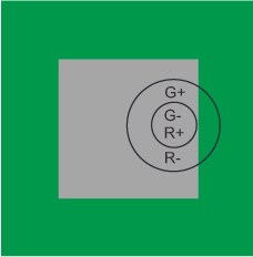
The simultaneous contrast comes about analogously: Let us imagine a double opponent color cell for the red-green channel of which only its center is in the part of the gray bar surrounded by green in
figure 18 (simultaneous contrast 1). This case is illustrated in figure 21 (Double opponent color mechanism 2). The gray stimulates the M- and L-cone cells connected to the cell center, but there is no net excitation. The green background, on the other hand, acts primarily on the M cones and causes excitation in the oppositely connected red-green channel of the cell edge. In sum, the described cell responds with an excitatory signal that is interpreted as red because it stimulates the channel in the same way as a red stimulus in the center. The result is our slightly reddish perception of the actually gray bar (see figure 22 – Double opponent color Mechanism 3). We observe the opposite with the section surrounded by red. Here, the red-green channel responds with an inhibitory signal and we perceive the gray as slightly greenish. A similar process occurs in the yellow-blue channel’s double opponent color cells. This tells us why we perceive colors as a function of their background and why any larger colored area tends to color the adjacent regions in its complementary color.
Just as with the opponent color mechanism, we can ask ourselves why the visual system took this path, which at first glance seems complicated. And just as before, the answer is that it is the most efficient way of processing information. The spatial contrast in brightness and color makes the visual system sensitive to changes in reflectance and thus to the edges and borders between objects. They are the only important information that the apparatus in our heads needs to construct the shapes, the forms of things in our environment. It is unnecessary to define brightness and color at every single point of, for example, a solid red object. Instead, it is quite sufficient to do this everywhere where something changes. This is especially true at edges or boundary surfaces. This significantly reduces the amount of information required for transmission and processing.
We can see exactly how much by comparing two graphics in .tif or .jpeg format. Let’s assume that the image shows a red circle in the middle of a green area in 10×15 cm format. In .tif there are 1715 KB. In .jpeg only 13 KB – 132x less. The reduction is due to the fact that .jpeg, just like the visual system, only defines those pixels where something changes. The file only contains the border position and color on the inside or outside. The image processing program automatically fills in the pixels in between.
This reduction in the amount of information is eminently important for the nervous system in general, because for a nerve cell to fire, energy is required and the body must use this raw material as sparingly as possible. – Keep in mind that the brain has a particularly high demand for oxygen and energy. Despite being only 2% of the body’s mass, it uses 20% of oxygen and 25% of glucose. So fewer active nerve cells are better for the body.
But resource conservation is not the only reason for spatial contrast. In addition, it enables the visual system to reproduce the surface properties of objects in a largely identical way, even under the qualitative variations in illumination described above. If it were not able to do this, our perception of object colors would fluctuate considerably throughout the day, and this would be a major obstacle to our ability to identify food as food, for example.
Nigel Daw’s (10) demonstration of color constancy in goldfishes confirms its fundamental role in color perception. This arises less from a specific need than from the striving of the overall system for economy and the lowest possible energy consumption, the „waste products“ of which are color constancy and simultaneous contrast. David Hubel, the neurphysiologist and Nobel Prize winner, summarizes this connection in the following sentence:
„… evolution can hardly have anticipated tungsten or fluorescent lights, and until the advent of supersuds, our shirts were not that white anyway.„
We owe important empirical evidence for the existence of color constancy to the American researcher and entrepreneur Edwin Land, better known to many as the inventor of the instant camera system Polaroid-Land. His experiments with the so-called color mondrians, illustrations of multicolored and multiform paper scraps reminiscent of the works of painter Piet Mondrian, proved to be a great boon to science and culminated in the Retinex Theory (12), which describes a model of color constancy. Land used three slide projectors, each featuring a controllable red, green, and blue color filter, to illuminate the Mondrians. He discovered that the exact intensity settings of the projectors were irrelevant to the mondrians' perception of the colors. It is possible to determine the intensities for each projector with a photometer on, for example, a blue color part and to transfer these values to the observation of a green or any other surface without changing the perception of the second color. - Green remains green, even though the measuring device displays the same values as before for blue.
Land and his team went one step further and developed formulas to determine the color of an object independent of the light source. They calculated the ratio between the measured light at the color-determining point and the average light of its surroundings for each of the three projectors. With these numbers, the color for each point can be determined in a color space with the three axes red, green and blue. The possibility of calculating a color in this way predicts its independence from the type of illumination, because all that matters for each wavelength range is the relationship between a given point and its surroundings.
The fact that subjects accurately perceived the colors in the mondrians, even when only two projectors illuminated them with the blue and green parts of the spectrum, demonstrates that our visual system functions in a similar manner. This also aligns with the previously demonstrated calculation capability, as it enables the determination of a ratio from just two wavelength ranges.
The largely constant perception of color and brightness makes our everyday lives easier. However, the moments when this corrective fails are particularly exciting.
Next Approximate color constancy does not mean complete color constancy
Main Lightness and Color
Previous Like on TV – The reason for the complicated procedure
 Since I started my first website in the year 2000, I’ve written and published ten books in the German language about photographing the amazing natural wonders of the American West, the details of our visual perception and its photography-related counterparts, and tried to shed some light on the immaterial concepts of quantum and chaos. Now all this material becomes freely accessible on this dedicated English website. I hope many of you find answers and inspiration there. My books are on