

You are here: Nature Science Photography – Lightness and color – The reproduction of lightness and color
Now that you know according to which laws our visual system constructs color impressions, it is surely easy for you to say how we can technically generate and reproduce them, isn’t it? Exactly, by creating a wavelength stimulus that excites the photoreceptors to exactly the same degree as the original. In terms of reproducing color impressions, it is a wonderful thing that our visual system interprets spectrally different composed stimuli as the same. Otherwise it would be impossible, for example, to take a photo of your hands and recognize them as such, because the dye industry is (fortunately?!) not able to use skin in their products! And this is the only way we can reproduce a wide range of colors with only three basic ones. Computer monitors produce a whopping 16.7 million colors with one red, green and blue pixel each. If our perceptual apparatus cared whether, for example, the color impression of yellow is created by a single pixel or by the combination of the green and red pixels, we could easily bury the idea of inexpensive monitors on every desk. Films and digital image carriers, as we will see in detail, also work with only three basic colors. It is hard to imagine the disadvantages of a slide’s sharpness if its emulsion had to have a larger number of layers due to its construction. We can create the necessary identical wavelength stimulus by mixing different wavelength ranges (additive mixing) or by removing certain parts of a reflected spectrum (subtractive mixing).
The additive mixture
In additive mixing, several spectral components of light complement each other to form something new. We encounter it quite practically when the daylight reflected from the sky and the more reddish light of artificial room lighting meet on the white page of a book and reach our eyes as a new color stimulus. In theatrical performances and other stage shows, this direct mixing is mimicked with the use of colored spotlights.

Another way of combining different colored lights is partial mixing. Light sources that are too small to see are placed next to each other here. This takes place in color television and the computer monitor, where three electron tubes fire through a dot mask at different points on the picture tube, causing three different types of phosphors to glow there. Each of these luminous points then produces light in one of the additive primary colors. Because the three resulting frames are so close together, we perceive them as a full-color new image. Partitive mixing was also used by the painters of pointillism. They built their paintings from tiny dots of different colors. With a magnifying glass, these blobs of color are clearly distinguishable, but from a meter away they blur into uniform areas of color.
Additive mixing of light is based on Young-Helmholz’s three-color theory of the primary colors red, green, and blue, which can be used to mix most of the colors that we humans perceive. It follows the following rules:
Red + Green = Yellow
Red + Blue = Magenta
Green + Blue = Cyan
Red + Green + Blue = White
Black is the absence of light
The subtractive mixture
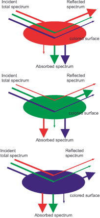
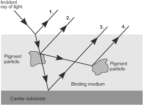
Subtractive mixing, which involves the removal of portions of an incident spectrum by dyes and pigments, inversely describes the behavior of body colors. Soluble dyes produce subtractive color impressions by first converting the light energy of certain wavelength ranges into molecular vibrational energy and then converting this energy into heat through friction and radiating it. They are frequently used for dyeing textiles. Conversely, we encounter pigments in their undissolved crystalline form. This particle structure, which ranges in size from 1/500 to 1/2000 millimeters, functions by scattering the incoming light waves. Plastic foils, for example, are colored with pigments.
Each case results in the same effect: the colorants extract one or more parts from a body that no longer emits the entire spectrum from blue to red. Blue paint is therefore blue because it absorbs the wavelengths of the yellow, orange and red range and reflects only blue and some green. Similarly, red paint absorbs blue and green and reflects only red and some yellow.
Since, as we have seen, the photoreceptors in our eyes have their sensitivity maxima in the blue, green, and red regions of the spectrum, subtractive mixing relies on the primary colors cyan, magenta, and yellow to produce the best possible stimulus. Their mixture leads to the following results:
Cyan + Magenta = Blue
Magenta + Yellow = Red
Cyan + Yellow = Green
Cyan + Magenta + Yellow = Black
White is the absence of any dye

The relationship between the additive and subtractive primary colors
The rules of additive and subtractive color mixing only reveal half of the story, as their primary colors share an intriguing relationship: each primary color in one system has a complementary color
(Latin complementum = complement) in the other system. These complementary colors are opposite each other on the color wheel, complementing white in additive mixing but black in subtractive mixing.
Mixture of complementary light colors:
Red + cyan = white
Green + magenta = white
Blue + yellow = white
We can observe the direct effects of the opponent color mechanism in these pairings: red + cyan, green + magenta, and blue + yellow complement each other to form white, due to the balanced activity in the red-green or blue-yellow opponent color channel. The same principle applies to all other analogously occurring combinations.
Mixture of complementary body colors:
Red + cyan = black
Green + magenta = black
Blue + yellow = black
Furthermore, we can construct each of the additive primary colors from its two subtractive counterparts, which are not in opposition to each other on the color wheel. The same applies to the subtractive primary colors.
Blue + green = cyan
Red + green = yellow
Blue + red = magenta

Magenta + yellow = red
Cyan + yellow = green
Cyan + magenta = blue
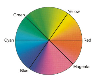
Too many color names at once? – You can easily remember the colors opposite each other in the color wheel by using a mnemonic slogan. Just keep the pairings (RGB and CMY) in mind. The first color in RGB – red – is the complementary color to the first color in CMY – cyan – and so on.
Next RGB, CMYK – Description of impressions in device-dependent reference systems
Main Lightness and Color
Previous Not yet answered – The question of why
If you found this post useful and want to support the continuation of my writing without intrusive advertising, please consider supporting. Your assistance goes towards helping make the content on this website even better. If you’d like to make a one-time ‘tip’ and buy me a coffee, I have a Ko-Fi page. Your support means a lot. Thank you!
 Since I started my first website in the year 2000, I’ve written and published ten books in the German language about photographing the amazing natural wonders of the American West, the details of our visual perception and its photography-related counterparts, and tried to shed some light on the immaterial concepts of quantum and chaos. Now all this material becomes freely accessible on this dedicated English website. I hope many of you find answers and inspiration there. My books are on