

You are here: Nature Science Photography – Visual acuity – The resolving power of the visual system
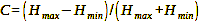
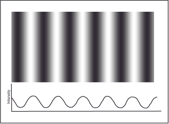
Contrast plays a major role in the visual system’s ability to distinguish fine details from one another, because this is possible only when the difference in brightness between them reaches a certain minimum level. Consequently, the visual system exploits its maximum resolving power only when the original has the highest possible contrast between black and white, because its contrast sensitivity is greatest in the color-blind where-channel (see chapter „First processing stage – Categoriziation of information“ in „The perception of lightness and color“). In everyday life, we frequently perceive objects that a) have a significantly lower contrast to their background and b) vary considerably. Therefore, we naturally explore how the resolving power alters when the contrast decreases from its highest value. To find this out, we use grating patterns of alternating black and white lines with different numbers of line pairs per millimeter (spatial frequencies), as shown in figure 11 (sinusoidal grid pattern). The brightness changes in a sinusoidal pattern, as it best aligns with human perception. Figure 12 (sinusoidal brightness gradients) shows sinusoidal brightness patterns for 100 % contrast, 50 % contrast and 10 % contrast. The following formula calculates the grating’s contrast:
Formula 2
C = Contrast
Hmax bzw. Hmin = Maximum or minimum brightness value
So, for the 100 % contrast grid, C = ((1-0)/(1+0)) = 1.0 or 100 %. For the 50 % grid with the maximum brightness of 0.75 and the minimum of 0.25, the formula says C = ((0.75-0.25)/(0.75+0.25)) = 0.5/1.0 = 0.5 or 50 %. And the 10 % grid is calculated by K = ((0.55-0.45)/(0.55+0.45)) = 0.1/1.0 = 0.1 or 10 %.
Contrast plays a major role in the visual system’s ability to distinguish fine details.
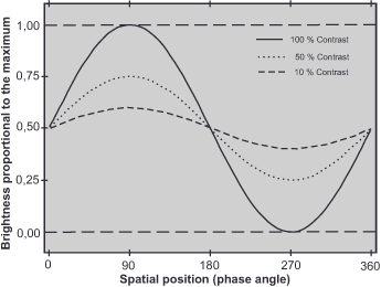
To determine the sensitivity of our visual system, we need to know the contrast thresholds for the different spatial frequencies. To determine them, the contrast of a given frequency is reduced until a subject is just able to resolve it. Plotting these values on a graph yields a threshold curve, as in figre 13
(threshold curve) from which the minimum contrast for each spatial frequency can be read. The reciprocal (1/threshold) of this contrast threshold is called contrast sensitivity, because the lower the minimum contrast, the higher the sensitivity for a given spatial frequency. If the threshold is 0.1, the sensitivity is 1/0.1=10; if the threshold is 0.01, the sensitivity is 1/0.01=100; and so on. Plotting these reciprocals against spatial frequency on a graph yields the contrast sensitivity curve, also known as the visibility curve. It is nothing more than the inverse threshold curve, because the more sensitive we are to a spatial frequency, the less contrast is needed to resolve it. Figure 14 (contrast sensitivity curve) shows such a visibility curve for an average adult. We plot the spatial frequencies in line pairs per degree on the x-axis, the contrast thresholds on the left y-axis, and the contrast sensitivity values (1/threshold, all logarithmic) on the right y-axis. The curve reveals that reducing the contrast to 1/10 of the maximum value results in a 65 % reduction in resolving power, while reducing it to 1/100 results in a mere 15 % reduction. Furthermore, it shows us that at the peak, with a contrast sensitivity value of 500, we perceive a contrast of only 1/500 or 0.2 %. That is, we can distinguish pairs of lines that differ by only 0.2 % relative to the average brightness.
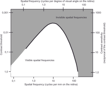
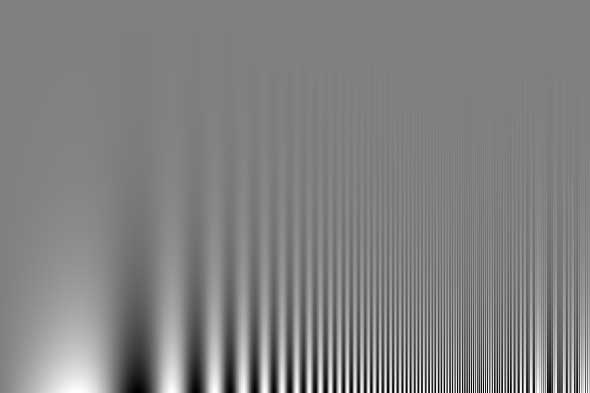
Figure 15, created by Mr Campbell and Mr Robson, shows the visibility curve in an intuitively understandable shape. The brightness modulates sinusoidally along the horizontal axis, while the spatial frequency modulates logarithmically. Along the vertical, contrast also varies logarithmically from 100 % to 0.5 %. If one follows any horizontal path through the image, the brightness of the black and white grating remains constant. Thus, if image contrast were the only factor in contrast perception, the alternating black and white lines would have to be the same everywhere. But they are not. They appear higher in the center of the image than they do towards the two edges, and this inverted U-shape represents our contrast sensitivity function. The exact position of the peak depends on the viewing distance. – Vary it sometime to see for yourself and notice how the perceived position of the peak changes. So the inverted U-shape is not an attribute of the image but reflects a property of your visual system.
Neurophysiologically, several factors contribute to the shape of the contrast sensitivity curve. First, there is the nature of certain ganglion cells in the retina and in the corpus geniculatum laterale (CGL) in the midbrain. They are divided into a center and its surrounding area (center-surround organization, see figure 20 – center-surround cell – in the chapter about „Contour sharpness“), which are either inhibited or excited by light incidence. This type of information processing plays a fundamental role in the function of the visual system, enabling it to be independent of global changes in brightness and sensitive to sharp transitions, such as edges, which we encounter in many other contexts. If a cell center responding with excitatory signals fits exactly into the bright part of a sinusoidal grid mapped on the retina, the ganglion cell will respond with a strong signal. We could also say that it responds best to this spatial frequency. Large receptive fields organized as a center-surround respond best to low spatial frequencies; small fields respond to high spatial frequencies. Because the number of cells is different for the different-sized receptive fields, our ability to perceive the different frequencies is also different. This structuring exposes us to multiple perceptual channels with varying sensitivities, externally manifested in the contrast sensitivity function.
Furthermore, the sensitivity drop-off in the low-frequency range is due to lateral inhibition and the brightness adaptation mechanism, which makes us comparatively insensitive to brightness changes in such large fields. The high-frequency dropout is partially caused by imperfect eye lenses and inevitable aberrations from diffraction and aberration.
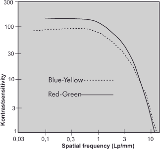
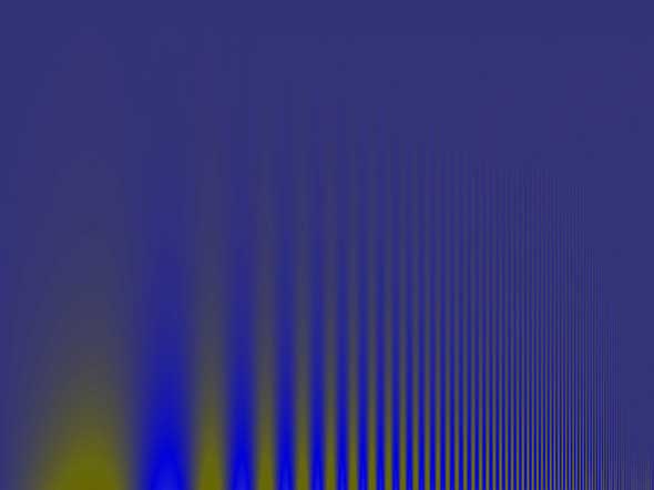
The color-sensitive what-channel of the visual system has a strikingly different contrast sensitivity from the where-channel, which responds only to differences in brightness (see „Visual image creation„). As shown in figure 16 (contrast sensitivity of the color channels), it is highest at low frequencies (coarse features) and drops rapidly for small details. This means we can distinguish differences in a scene that differ only in color much less well than those that also or only show a difference in brightness. This characteristic arises from the fact that the color-blind where-channel combines the potentials of all three photoreceptor types, while the opponent-color channels of the same system only converge the information of two receptor types. In addition, the receptors responsible for the long-wavelength red, medium-wavelength green and short-wavelength blue regions of the spectrum occur in greatly decreasing numbers, so that the spatial resolving power is correspondingly lower. How this becomes practically noticeable, you can see for yourself in figure 17 (CFS red-green) and figure 18 (CFS blue-yellow), if you compare them directly with figure 15 (Campbell-Robson CFS Chart).

The sensitivity for low spatial frequencies is higher than in figure 15. However, high frequencies are somewhat less easily recognizable (above) or much less easily recognizable (below).
Next The total resolving power of the visual system
Main Visual acuity
Previous The brightness
If you found this post useful and want to support the continuation of my writing without intrusive advertising, please consider supporting. Your assistance goes towards helping make the content on this website even better. If you’d like to make a one-time ‘tip’ and buy me a coffee, I have a Ko-Fi page. Your support means a lot. Thank you!
 Since I started my first website in the year 2000, I’ve written and published ten books in the German language about photographing the amazing natural wonders of the American West, the details of our visual perception and its photography-related counterparts, and tried to shed some light on the immaterial concepts of quantum and chaos. Now all this material becomes freely accessible on this dedicated English website. I hope many of you find answers and inspiration there. My books are on