

You are here: Nature Science Photography – Lightness and color – The perception of lightness and color
Now we have established that the photoreceptors are causally responsible for the generation of color stimuli. This was not such a big surprise, but one has to start somewhere. Furthermore, we observed that the retina separates and processes brightness and color separately early on. That was a surprise. Even more surprising, perhaps, is that the signals delivered by the receptors are not simply transmitted to the brain as they are. To see what happens instead, we experimented around a bit. First with brightness, then with color.
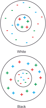
Take a look at figure 11 Simultaneous contrast SW. As you can see from the lower part of the graph, the gray square in the right panel appears darker than in the left panel, despite both having the same amount of black. The difference lies in the lighter or darker background. From this, we can conclude that the visual system constructs an object’s brightness as a function of its surroundings. We call this
relative brightness perception.
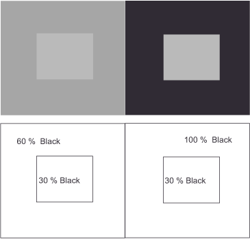
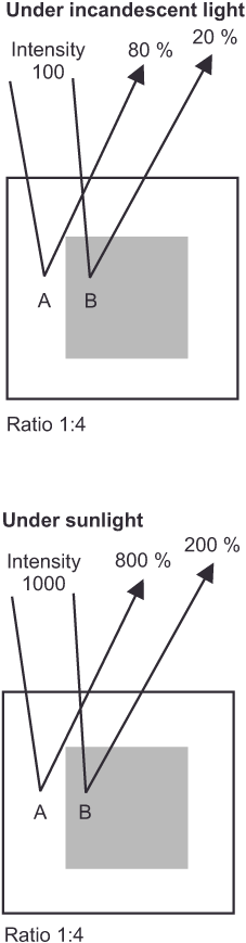
Now, a thought experiment. Under the window of your study, two cars stand side by side on the street. One is jet black, the other snow white. Because you have a lot to do, you sit at your desk early in the morning, work through lunch, and don’t put your papers aside until the day is already drawing to a close. Of course, you take creative breaks, stretch a little and look out the window. When you think of this situation in light of your everyday experience, what comes to mind? – No, I’m not suggesting that your pay is inadequate for working so many hours! The lighting conditions change throughout the day with the position of the sun and the passing clouds, and yet the black car always remains black and the white car always white. If our visual apparatus formed brightness values based only on the amounts of light reflected, they would have to change under different intensities of illumination; the white car would have to look gray at times, and the black car would have to look whitish at times. But think about it: something stays the same no matter how much or how little light falls on the two cars. A second example might be right in front of you on a smaller scale. The black letters on the pages of any book appear black to us, and the paper is white, no matter how bright or dark it is in the room. This allows us to conclude that the visual system constructs the brightness of objects to be constant, that is, independent of the intensity of illumination. We refer to this as constant brightness perception.
Now about color. Close your eyes once and imagine a reddish yellow, orange, that is. Did it work? Great, that was easy! Let’s try it again right away. This time with the reddish blue that our largest German telecommunications company has chosen as its brand color – magenta. I’m sure you won’t find that difficult either. Will you? It’s the same with mixtures of blue and green (aquamarine blue) or yellow and green (lime green). But now I’ll get you, I bet. The fifth and sixth attempts are for a reddish green and a yellowish blue, respectively. Take your time and try hard.
Well, it doesn’t work, does it? But that doesn’t matter, because no normally color-sighted person can imagine or perceive colors like these. Given this circumstance, our visual system must be the cause. It cannot be because of the cone receptors. It should be easy for them to produce such color impressions because they are quite sensitive in these areas of the spectrum. Nevertheless, it appears that our visual system has four basic colors at some point behind the photoreceptors that are not identical to those of additive and subtractive color mixing: blue, green, yellow, and red. We can verbally describe all colors we perceive as mixtures of these four basic colors. The physiologist Ewald Hering first noticed this connection in 1878, and in his subsequent experiments, he discovered a further connection:
People who are red-blind are also green-blind
People who are unable to perceive blue also cannot see yellow
Colored afterimages (also known as successive contrasts) follow the same rules. Look strained for about 30 seconds at the red square in the upper part of figure 12 (colored afterimage), then look at another white surface and blink. In the afterimage that appears, you should perceive a cyan square. Similarly, when you look at the blue square, you should see a yellow afterimage.

In 1878, Hering summarized these findings in the thesis that red and green, blue and yellow, and black and white are each linked to form a pair of opposites, and from this he formulated his theory of
opponent colors. In it, he devised three simple mechanisms for explanation, each of which reacts in opposite ways to light of different wavelengths and intensities.
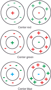
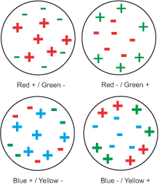
The black – / white + mechanism responds positively to stimulation at each type of cone, signaling brightness. Red + / Green – responds positively to red and negatively to green. Blue – / Yellow +
responds negatively to blue and positively to yellow. According to theory, all pairings should also occur in reverse. However, since no physiological process was conceivable at Hering’s time or well into the 20th century that could have caused this, the opponent color theory lived a wallflower existence for decades.
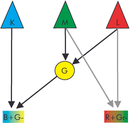
It was not until the neurophysiological research of the 1960s and 70s that evidence was found for a neuron responding with opposite electrical signals to different wavelengths, the opponent color cell, in the retina of a carp genus and in the CGL of the rhesus monkey (4, 5, 6). In 1966, David Hubel and Torsten Wiesel conducted a detailed study of these cells in the CGL of macaque monkeys, identifying three typical cell classes (7, 8). Since the ability to perceive color is almost as pronounced in this primate species as it is in us humans, we may rightly assume that our visual system has the functionally same neurons that we naturally find in the color-sensitive what channel.
Type 1 cells (midget cells in the retina or parvo ganglion cells in the CGL): They mark the high-resolution shape channel of the what-system, possess small receptive fields divided into center and surround. The center receives excitatory or inhibitory signals from one cone type (L-red, M-green, or K-blue) at a time. The surrounding area receives analogous excitatory or inhibitory signals from the respective opposite color cones. Thus, the combinations are R+/G-, R-/G+, G+/R-, G-/R+, B+/R+G)-, B-/R+G)+ (yellow results from the combination of the L and M signals). The cells are color-selective because they are excited by one region of the spectrum and inhibited by another region of the spectrum.
Type 2 cells (midget-like cells in the retina): They mark the lower-resolution color channel of the what system, have larger receptive fields than type 1 cells, and have only one center. The center receives excitatory signals from one type of cone and inhibitory signals from another. Thus, the combinations are R+/G-, G+/R-, B+/R+G)-, B-/R+G)+ (yellow results from the combination of the L and M signals). Many scientists today assume that these cells mark the first stage of our color perception.
Type 3 cells (Parasol cells in the retina or Magno cells in the CGL): They mark the where channel, have the largest receptive fields of the three cell types, divided into center and surround. Both the center and surround receive excitatory and inhibitory signals from all three cone types. They are neither color-selective nor color-opponent, i.e., color-blind, and respond to increases or decreases in intensity.
In addition to these, the so-called bistratified cells were later discovered, which are functionally and neurochemically fundamentally different from the magno and parvo ganglion cells and project to the coniocellular layers of the CGL (coniocellular means „cells small as dust“). They make up about 10% of retinal ganglion cells, and they have very large receptive fields with only one center. The center is always excited by B cones and inhibited by R+G cones. They exhibit intermediate spatial resolution and respond to average contrasts. However, scientists have not yet universally accepted this cell type, and aside from providing a third channel to the visual cortex, the role of the coniocellular system in visual perception remains unclear. We cannot rule out its contribution to color perception. It is also widely believed to play a role in integrating somatosensory/proprioceptive and visual information. Proprioception, from the Latin proprius = oneself, refers to the relative position of adjacent body parts. In contrast to the six exteroceptive senses (sight, hearing, taste, smell, touch and balance), with which we perceive the external world, and the interoceptive sense, with which we perceive pain and the movements of the internal organs, the proprioceptive sense gives us information about the internal state of the body.
Hubel’s and Wiesel’s results fit surprisingly well with the requirements of Hering’s model, which, after all, provides opponent color cells for the red-green channel, the blue-yellow channel, and the intensity channel (the brightness). In practice, a first step would involve rearranging the stimulus patterns of the S, M, and L cones in the retinal network of horizontal, amacrine, and bipolar cells to oppose each other in a red-green channel (L-M), a blue-yellow channel (S-(L+M)), and a black-white channel (M+L or S+M+L) for intensity. – You noticed? Yellow is created by combining the L and M signals. In the second step, the sorted data reaches the type 2 opponent color cells in the retina and the CGL. Depending on which of the excitatory and inhibitory stimuli dominates, the cell gives a signal corresponding to the difference in the corresponding channel for the respective area of the retina. However, the precise nature of the necessary regrouping of receptor signals in the retina remains unclear and even highly controversial. Furthermore, the model does not adequately address some other questions, and there are scientists who believe that the opponent color mechanism is located at a higher level, in the primary visual cortex. However, until we find solid evidence, this remains the best explanatory approach.
Thus, the signals for yellow and blue or green and red travel in the same channel but cannot do so at the same time, explaining why we cannot perceive a reddish green or a yellowish blue. With the colored afterimage, it behaves in such a way: If we look for a longer time at a surface of a given color, the pigments in the respective active photoreceptors consume themselves, and their neuronal reaction becomes weaker. As a result, the corresponding opponent color channel becomes unbalanced and we perceive the complementary color of the original stimulus.
The type 3 cells of the brightness channel function slightly differently, as they generate a difference in values for a specific point within the retina and its surrounding areas. For this purpose, the excitatory signals of all three types of cones of the respective retinal position (some scientists believe it is only those of the M and L cones) combine in the center of the cell and are weighed against the inhibitory output of their directly neighboring conspecifics in the cell border. This type of processing, with a quasi-spatial reference, explains the phenomenon of relative and constant brightness perception shown at the beginning. The two inner squares in figure 11 (Simultaneous Contrast) appear differently bright to us because they reflect the light in a different ratio in relation to the background in each case. At the same time, we always perceive the black of the letters and the white of the pages of a book as black and white, respectively, because the ratio between the amount of light reflected by the two always remains the same. Figure 17 (Constant brightness perception) illustrates this relationship. This ratio formation enables them to evaluate each brightness value in contrast to its background while disregarding any change in illumination intensity. Without this comparison, these perceptions would be difficult to explain. The same ratio formation will be encountered again in the next section on the third processing stage with respect to color perception, and we will learn the reason for this behavior.
Are black and white colors or just brightness values?
This question often elicits controversial responses. Neurophysiologically, the answer is quite simple. Following the level of photoreceptors, brightness is one of the three axes on which a color value is determined. This means in reverse that no color value can be defined without the addition of brightness. The difference between, for example, brown and yellow lies solely in the brightness, i.e., the different position on the black-white axis. Black and white are indeed colors. However, their lack of coloration is what defines them as achromatic colors.
Next Like on TV – The reason for the complicated procedure
Main Lightness and Color
Previous First processing stage – Categorization of information
If you found this post useful and want to support the continuation of my writing without intrusive advertising, please consider supporting. Your assistance goes towards helping make the content on this website even better. If you’d like to make a one-time ‘tip’ and buy me a coffee, I have a Ko-Fi page. Your support means a lot. Thank you!
 Since I started my first website in the year 2000, I’ve written and published ten books in the German language about photographing the amazing natural wonders of the American West, the details of our visual perception and its photography-related counterparts, and tried to shed some light on the immaterial concepts of quantum and chaos. Now all this material becomes freely accessible on this dedicated English website. I hope many of you find answers and inspiration there. My books are on