

You are here: Nature Science Photography – Lightness and color – The perception of lightness and color
Some aspects of color perception have already suggested it: our visual system prefers, in different ways, the long-wavelength end of the spectrum and the warmer colors located there. This is clear from the fact that there are a lot of M and L cones and their sensitivity peaks are close to each other in the mid- to long-wavelength range. It’s also clear from the fact that the fovea centralis can resolve very fine details using only information from M and L cones and that „pleasantly warm“ colors are very important to us emotionally. Some biologists believe this preference is due to the increased ability to distinguish between the mostly red fruits, which served our ancestors as food for a long time, and the green environment of the jungle. However, since our ancestors have always fed on more than fruits and berries, and other successful vertebrate species lack this preference, we may, with some justification, assume that there is another background for this. – A short excursion into optics shows us the way.
Chromatic aberration, for example, is a serious optical problem when a large eye develops sensitivity to a wide range of the spectrum. This term makes lens experts sit up and take notice, doesn’t it? Indeed, the same challenge confronts the designers of our recording optics. When light passes through a lens, the short-wave blue component is refracted more strongly than the long-wave red component, so that the „blue image“ focuses at a point in front of the „red image.“
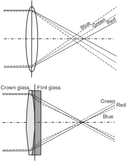
Uncorrected, the image would show overlapping color fringes, blurring the edges between light and dark areas in particular, and resolution and visual acuity would be severely impaired. Colleague engineers prevent this aberration with more or less complex lens designs, the simplest of which consists of a concave (curved inward) and a convex (curved outward) double. The lenses in our eyes are convex. In order to remove the color defect described above (i.e., to make them achromatic), their focal length would have to be longer than the eye diameter allows. Biologically, this method is costly and therefore not very economical. However, the longer wavelengths, more yellow-red, region of the spectrum must be refracted much less under the given conditions to provide a sharp image and thus requires less perfect optics.
Accordingly, evolution solved the optical problem posed by the color capability of our visual system, not with a more complicated eye design, but with various adaptations of the functional units involved, all with one goal in mind: to mitigate the detrimental effect of shorter wavelengths on imaging quality and to increase edge sharpness. The dimensions of the eye, tuned in all areas to design the best image in the medium- to long-wavelength range, are part of this basket of measures. A little further in, the slight yellow tint of the lens and the thin, also yellow, veil of pigment over the fovea centralis effectively filter out the shorter part of the spectrum. At the level of the photoreceptors, the arrangement of the pigment discs inside them ensures that they respond as little as possible to light incident from the side. – Most of the shorter, blue components scatter to the side. The exclusive placement of medium- and long-wavelength receptors in the fovea centralis (and the banishment of short-wavelength S receptors from the fovea centralis) ensures guaranteed sharpness where it is most needed. And simultaneously, moving the sensitivity maxima of these sensory cells closer together reduces color contrast. Deeper in the retina, the decoupling of brightness information from color information, as provided by the processing in the opponent color cells, ensures that color has the least possible impact on the quality of the image. These adjustments allow the fovea to be amazingly effective at distinguishing edges and boundaries in both low and high contrast situations. And without them, you would hardly be able today to do the tremendous pattern recognition necessary to read the letters on these pages.
Next Not yet answered – The question of why
Main Lightness and Color
Previous Fourth processing stage – Generation of impressions
If you found this post useful and want to support the continuation of my writing without intrusive advertising, please consider supporting. Your assistance goes towards helping make the content on this website even better. If you’d like to make a one-time ‘tip’ and buy me a coffee, I have a Ko-Fi page. Your support means a lot. Thank you!
 Since I started my first website in the year 2000, I’ve written and published ten books in the German language about photographing the amazing natural wonders of the American West, the details of our visual perception and its photography-related counterparts, and tried to shed some light on the immaterial concepts of quantum and chaos. Now all this material becomes freely accessible on this dedicated English website. I hope many of you find answers and inspiration there. My books are on