

You are here: Nature Science Photography – Lightness and color – Opponent color combinations in image composition
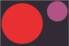
Quantity contrast refers to the proportions of color areas and their luminosity. When we combine color areas of equal size, some colors, like yellow, stand out while others, like violet, fade into the background. We must apply two criteria when determining color quantities: A) the luminosity and B) the size of the color areas. It was Goethe who determined the color weights. They are still valid today and can be used as a rule of thumb for the size comparison. And they can be explained by the different sensitivities of the cone receptors.
Yellow = 9, Orange = 8, Red = 6, Violet = 3, Blue = 4, Green = 6
To perceive a color combination as balanced and harmonious, their proportions should align with the inverse brightness ratio. For example, violet and green represent 3 and 6, and therefore the quantity proportions of these colors should be in the ratio 6:3. The image should contain twice as much violet as green so that it appears balanced. If this is the case, we call the quantity contrast harmonic. Conversely, when the ratios significantly diverge, we refer to it as excessive quantity contrast. This is a useful way to add tension and drama to an image. However, if you selectively use an intense color where it’s important, we call this a signal effect. When you sum up the values of complementary color pairs, you consistently obtain the value 12.
Orange + Violet-Blue = 3 + 9 =12
Orange-red + cyan = 4 + 8 = 12
Magenta + Green = 6 + 6 = 12
Next Light also has a temperature
Main Lightness and Color
Previous Quality contrast
If you found this post useful and want to support the continuation of my writing without intrusive advertising, please consider supporting. Your assistance goes towards helping make the content on this website even better. If you’d like to make a one-time ‘tip’ and buy me a coffee, I have a Ko-Fi page. Your support means a lot. Thank you!
 Since I started my first website in the year 2000, I’ve written and published ten books in the German language about photographing the amazing natural wonders of the American West, the details of our visual perception and its photography-related counterparts, and tried to shed some light on the immaterial concepts of quantum and chaos. Now all this material becomes freely accessible on this dedicated English website. I hope many of you find answers and inspiration there. My books are on