

You are here: Nature Science Photography – Lightness and color – The perception of lightness and color
It took several hundred million years for our eyes to develop from the first sensory cells that only served to distinguish between light and dark. In parallel, about 500 million years ago, the development of a physiological apparatus capable of distinguishing individual wavelength ranges of the spectrum began. A milestone of this process was the ability to separate three different wavelength ranges about 35 million years ago, which laid the foundation for our color vision today.
Where the advantages of color perception lie quickly becomes clear when we pick up the thread that the volume „Image creation, Depth and Size“ began to spin: Seeing is information gathering. Those who know more can better orient themselves in a complex environment, can react better and faster, and survive longer. In this sense, the distinction between light and dark is good and useful but does not yet make it possible for us to experience the world in all its fullness of information. However, this is essential, for example, to efficiently obtain food or reliably recognize predators. So even if the ability to see colors was only a coincidence, it would have quickly helped the individuals or species it affected to gain superiority and consequently become widely accepted in evolutionary terms. As the physiological development of living beings progressed, their social interactions became more complex, and colors became more important in terms of sexuality, the rearing of offspring and the response to disease. And our long artistic tradition, from the first rock and cave drawings to the more elaborate production of textiles and modern painting, is only the logical continuation of this line of development.
At the present stage of evolution, colors are so natural to us that we would not even think of asking ourselves where they come from. Spontaneously, most of us would probably say that color is a property of the objects we perceive, wouldn’t we? But science knows better by now, so let’s first torpedo our comfortable self-assurance and shake ourselves awake. Let’s look at an experiment.
The experimental setup by physiologist A. Gelb in 1929 looks like this. He presented a pane of glass to his subjects, who each described it as extremely dark, nearly black, in a dimly lit room with black walls. At the start of the experiment, Gelb illuminated only that pane of glass with a lamp hidden from observers. The amazing thing: To all participants, the pane now appeared white. Then he added a piece of white paper to the still illuminated glass pane, and by adding this new stimulus, the pane became black again in the perception of the subjects.
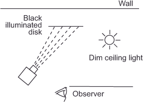
The same object thus appears to a whole number of normally sighted people sometimes black and sometimes white, depending on the constellation in which it is presented to them. If, as in the first example, the object exerts the brightest stimulus in relation, it appears white. Conversely, in the second case, adding an even brighter stimulus in direct comparison causes it to appear black. Only a sleight of hand could explain this circumstance if the color were solely an attribute of the object. Mr Gelb must have somehow distracted his subjects and replaced the disc. However, the man was a serious scientist, so we can rule out any trick. This leaves only the initially uncomfortable realization that color and brightness do not exist as quantities independent of us, which we merely detect. Instead, our visual system constructs both according to certain rules based on the intensity and spectral quality of what we know as light.
A spectrophotometer splits the reflected light from a colored surface to produce a reflectance curve (R-curve), which shows the intensity of light for each wavelength. For example, an object that we perceive as green may show the R curve in figure 2 Remission curve. This has a clear predominance in the medium-wavelength region of the spectrum (the so-called dominant wavelength), but it also contains to a lesser extent components from the rest of the visible spectrum. Interestingly, our eyes do not perceive this wavelength salad as yellowish green or greenish red, just as we do not perceive two simultaneously played different tones as such. Instead, we process the stimulus as a mixture. We can learn quite a lot about our visual system via the compositions of such mixtures.
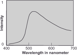
Remission curve – R-curve: The curve obtained by plotting the remission (combined absorption and reflection) of a body for each wavelength range.
Intensity distribution curve – I-curve: The curve that results when the intensities contained in the spectrum of a light source are plotted on a graph for each wavelength range.
Transfer curve – T-curve: The curve that results when we plot on a graph the range of the spectrum transmitted or absorbed by a filter.
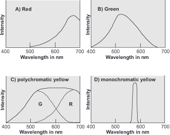
Let’s mix lights whose intensity distribution curves (I-curves) we know and of which we know what color impressions they produce. A red light (650 nm) and a green light (530 nm), for example, with the I-curves in figure 2 Intensity distribution curves A and B. What kind of color impression will the mixture of these two lights produce? The result of the addition of the two curves is shown in figure 3 Intensity distribution curves C, which we can describe as quite broad without a prominent wavelength range. The flat peak region of the addition curve is at 570 nm. By superimposing the two curves alone, we cannot predict the color impression, but if we actually performed the experiment, the visual result would be a yellow color impression.
Monochromatic light is spectrally pure and has only a single wavelength, whereas polychromatic light is a mixture of several wavelengths.
This is quite a surprise, because monochromatic yellow has an I-curve as in figure 3 Intensity distribution curves D and does not otherwise give the impression of containing a red and a green component. We can only explain the perception of the same color by our visual apparatus’s ability to interpret completely different spectra as identical. We refer to two colors that appear identical to us, despite having distinct intensity distribution curves, as metamers. This term will be of further interest to us because it is thanks to metamerism that we are able to reproduce color impressions at all with a reasonable technical effort.
So now we know that color perceptions must be based on different wavelength stimuli. The question remains how we capture and process them. To answer this question, let us look into our eyes.
Next Determining the physiological input stage – The eye
Main Lightness and Color
If you found this post useful and want to support the continuation of my writing without intrusive advertising, please consider supporting. Your assistance goes towards helping make the content on this website even better. If you’d like to make a one-time ‘tip’ and buy me a coffee, I have a Ko-Fi page. Your support means a lot. Thank you!
 Since I started my first website in the year 2000, I’ve written and published ten books in the German language about photographing the amazing natural wonders of the American West, the details of our visual perception and its photography-related counterparts, and tried to shed some light on the immaterial concepts of quantum and chaos. Now all this material becomes freely accessible on this dedicated English website. I hope many of you find answers and inspiration there. My books are on