

You are here: Nature Science Photography – Lightness and color – The reproduction of lightness and color
How necessary color management is in the digital field becomes clear when we consider what the output values of a scanner or a digital camera actually are. There, for each pixel, we get value triples such as R 98 G 50 B 101, which indicate the percentages of the primary colors. The mixture yields the color that corresponds to the intended device. As we learned in the previous two paragraphs, device-dependent color spaces are useful for describing relative color values, but they are not suitable for absolute color values. Their absolutely unambiguous description is important, however, if the data are to cross the device boundary and not become worthless in the process. Twentyfive years ago, when the circuits in the few already digital print shops were still closed, this did not pose any particular challenge in terms of color reproduction: employees knew exactly how their machines behaved and where they had to add a little more red, for example. Today, the processing chains are no longer so nicely heterogeneous, and yet everyone wants to see exactly what’s already coming out the back on the screen. To make this possible, we have to give the color values, which are only relatively determined from birth, an absolute interpretation standard. We achieve this by relating the RGB triples to the comprehensive Lab color space. Practically, we achieve this by attaching a table to the data that contains the corresponding Lab value for each RGB value, or at least a large number. Such a table is called an ICC profile after the standardizing institution, International Color Consortium. By linking the profiles of the input device, the output device and the monitor, it is possible to simulate the output result of a printer on the screen. – However, this simulation is limited because the color generation processes in the mentioned devices differ significantly.
A device profile is created by comparing a processed original with the original, correlating the color values and logging the deviations. So one scans, prints or photographs (with a digital camera) a panel with many different color patches (a so-called IT-8 target) and then passes this file to a special program that is able to compare the color values it contains with the known ones and write the correction table, the profile. We start a similar program to profile the monitor, which adjusts various hardware settings and measures the device’s color reproduction using a photospectrometer. The profile also incorporates the collected data. Such profiles, known as custom profiles, are the best way to ensure accurate color management because they describe the characteristics of each individual device. However, the combined hardware and software solutions required to create these profiles are not inexpensive. Therefore, most manufacturers deliver their products with generic profiles, which describe the average color reproduction of the entire series. Their advantage is that they come at no cost and provide at least approximate color control.
With a profile, you can basically do two important things. You can first assign it to an image file and use it to tell the color management system (CMS) how to interpret the RGB triplets. In this scenario, the RGB values remain unchanged, but the color impression they produce undergoes a transformation. This is useful to give the „raw“ data from a scanner or digital camera a real meaning. The CMS now understands the true meaning of the input device, which is represented by R 100 G 0 B 0. Second, You can convert the image file into such a profile. If you intend to use the image for a specific output process (such as imaging or printing), you should do this because the conversion of the color values ensures the preservation of the previously achieved color impression in the output device’s special color space.
As long as the color information to be converted occurs equally in both color spaces (the source color space and the target color space), the conversion is mathematically child’s play. The system simply transfers the values from one table (1:1) to the other. However, since some devices cover a larger color space than others (monitors, for example, can display much more saturated colors than printers), the 1:1 conversion is not always possible.
Your image editing program’s Gamut Warning function can help you determine which color values are not suitable for 1:1 conversion. It marks all corresponding image areas in a previously defined color. Depending on the subject type and the output process, you must choose one of four possible rendering intents to manage the problem areas.
The photographic rendering intent (also called perceptual) tries to maintain the coherence of the overall image by keeping the relative color distances between the color values. Thus, if the source color space is larger than the target color space, it compresses it until all source colors can be accommodated. This approach can cause problems with some images to the extent that it leads to lower saturation of many colors. However, if many tonal values are outside the target color space, as is often the case with images with particularly bright colors, this variant is still the best option.
The conversion priority absolute colorimetric projects colors that lie outside the target color space to their respective closest possible color values, whereby the color saturation and the brightness value may change. In addition, it simulates the white point of the source color space on the output medium of the respective target color space. For instance, this enables the display of a newsprint paper’s tone on the monitor or the white paper from the proof printer. This variant is only suitable for color photos in exceptional cases where you need to simulate a different printing process with your printer and see in advance how the image will look in white.
The conversion priority relative colorimetric works, as far as the conversion of color values outside the gamut is concerned, exactly like absolute colorimetric, but does not try to simulate the white point of the source color space but uses the one given in the target color space.
Last but not least, the saturation conversion priority converts the color values under the premise of the greatest possible saturation. Since this can lead to serious shifts in photos, it is primarily intended for presentations in which strong colors take precedence over absolute color accuracy.
The optimal conversion priority depends on the specifics of the original and planned output, making a general answer impossible. Color photographs very often fare well with perceptual when output to an inkjet printer and relatively colorimetric when converted from one color space to another.
One might assume that assigning a profile to an image for processing and then converting it to the output device’s color space is sufficient. After all, this limits all work from the outset to the number of colors available there, ensuring that one is protected from surprises in the proof. Some color management experts actually advise this approach, but I think it depends on whether you are sure that you will only output the image to that single output device in the future. Unfortunately, you never know what the future will bring, so it’s better to choose a color space for processing that leaves more than one path open. We refer to this alternative as the working color space, which serves as a link between the distinct color spaces of the input and output devices. It should be chosen to encompass the full gamut of the original, but no more than the total number of colors present in the potential output processes. – Size does not equal better here!
To explain this, I will briefly refer to the following section on digital imaging, as the reason is rooted in the way digital technology differentiates the tonal gradations in an image. In many cases, digital technology achieves this by using 8 bits or 256 color gradations per color channel. This results in 16.7 million (256 x 256 x 256) color shades. This sum is sufficient to differentiate the tonal spectrum within the limits of a given color space in such a way that we no longer perceive any gradations. The catch is that, of course, all color spaces, whether large or small, operate with a resolution of 8 bits. When we expand the color values from a small color space to a large one, we distribute the 256 possible brightness gradations of each color channel across a larger area, transforming the previously transitionless color gradations into visible ones. For exactly this reason, we cannot convert the color values directly in the input device into the actually ideal Lab color space: It is simply much too large for the data width of 8 bits compared to the common device color spaces. Only when we work with 16 bits (corresponding to 1024 brightness gradations) per color channel across all devices and programs will this gap close and make color management in its current complicated form superfluous.
Now we know the background and can look at the selection and suitability of the most widely used RGB working color spaces. A lot of smart people have already thought about this a lot more, so the choice is quite simple for us today.
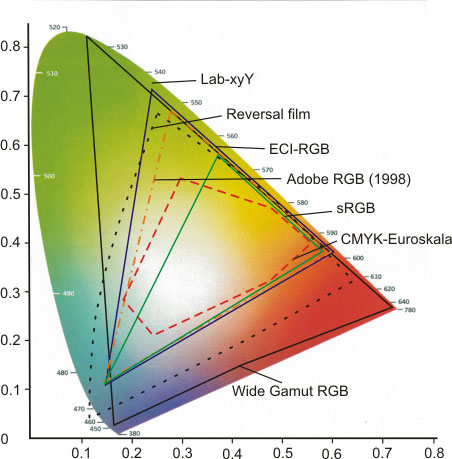
sRGBis designed for data output on average uncalibrated monitors. Thus it is predestined for any image output in transmitted light (monitor: internet, email / beamer: presentations). However, the image setters of most online imaging services also assume this color space, making it well suited for these purposes. Conversely, sRGB is unsuitable for offset printing due to its wider gamut.
Adobe RGB (1998) was designed to display a large number of CMYK colors on the monitor. With its significantly larger color spectrum compared to sRGB, especially in the cyan and green ranges, it is close to the gamut of most inkjet printers. This makes it a good compromise for both transmitted and reflected light reproduction, and it can certainly serve as a standard color space.
ECI-RGB is a color space developed by the European Color Initiative primarily for prepress. It is a good deal larger than Adobe RGB (1998) and contains mainly colors from CMYK printing.
Then there is the category of very large so-called wide gamut working color spaces, such as Ektaspace. Their use only makes sense if the template and output process also cover a large color range. This can be the case if you scan a slide, process it and expose it again on film. We must discourage its use in all other cases, as outlined above.
For the sake of completeness, I would like to mention that there are three other working color space categories: CMYK, grayscale and spot colors, but these are intended for very special output variants and thus fall outside the scope of the general consideration.
Color management is already implemented at the operating system level in the current Windows and Mac OS variants. Microsoft’s Image Color Management functions as an interface within the operating system that makes it possible to assign special profiles to monitors, printers and scanners in separate configuration dialogs and to make these available to the applications based on them. Apple’s ColorSync goes far beyond this approach. It also combines advanced color management tasks, such as embedding or converting profiles, in a central application window and is able to display device profiles in different views.
In practice, you can manage color using an application like Photoshop as follows: If the input device has not already assigned the appropriate profile to RGB data from a scanner or digital camera, you can assign it using the menu command Image – Mode – Assign Profile. Usually, this profile doesn’t align with the working color space, so you need to convert the image to it using the menu command Image – Mode – Convert to Profile. Now optimize the template in all respects according to your wishes, and after finishing this work, simulate the print result with the menu command View – Proof setup – Own. If everything is OK in this preview and no colors are displayed that are outside the printer or imagesetter gamut (you set up this display with the menu command Edit – Preferences – Transparency & Color Gamut Warning), save the image as a master file. Then convert it to the hopefully existing profile of the output device. However, it’s important to note that the process of achieving an optimal result can significantly differ a) across different programs and b) based on the desired outcome type. Therefore, comprehensive descriptions of all potential options can fill entire books.
Next Metamerism – Two colors in different light
Main Lightness and Color
Previous CIE-Lab – Description of impressions in device-independent reference systems
If you found this post useful and want to support the continuation of my writing without intrusive advertising, please consider supporting. Your assistance goes towards helping make the content on this website even better. If you’d like to make a one-time ‘tip’ and buy me a coffee, I have a Ko-Fi page. Your support means a lot. Thank you!
 Since I started my first website in the year 2000, I’ve written and published ten books in the German language about photographing the amazing natural wonders of the American West, the details of our visual perception and its photography-related counterparts, and tried to shed some light on the immaterial concepts of quantum and chaos. Now all this material becomes freely accessible on this dedicated English website. I hope many of you find answers and inspiration there. My books are on