You are here: Nature Science Photography – Lightness and color – Opponent color combinations in image composition
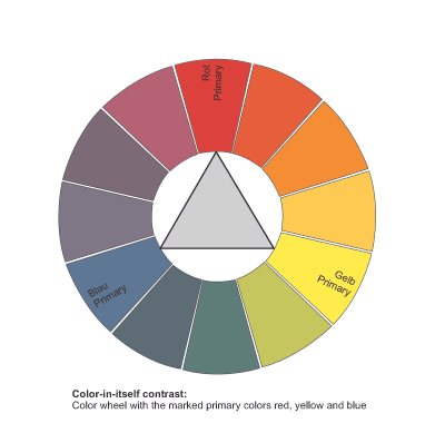
The simultaneous use of many bright and strongly saturated colors makes a picture appear very restless and can even tear it apart completely under certain circumstances. On the other hand, dividing a picture into a few easily distinguishable colors significantly enhances the image’s effect. This design scheme finds its strongest expression in the combination of the subtractive or additive primary colors, which, however, differ in their statement and effect. While the subtractive primary colors yellow, magenta (purple) and cyan (blue-green) appear friendly and loud, the distant combination of the additive primary colors blue, green and red appears more discreet and calm. An equal distribution of the colors is not an absolute prerequisite for a harmonious image effect; one or two colors may dominate the design. However, if you wish to weaken the contrast, you can achieve this by incorporating achromatic tones like black and white. In the wild, primary colors are rarely found in a form that can be easily designed. On the other hand, mass events such as fun fairs, the circus or carnivals like to use them.


Main Lightness and Color
Previous Cold-Warm contrast
If you found this post useful and want to support the continuation of my writing without intrusive advertising, please consider supporting. Your assistance goes towards helping make the content on this website even better. If you’d like to make a one-time ‘tip’ and buy me a coffee, I have a Ko-Fi page. Your support means a lot. Thank you!


 Since I started my first website in the year 2000, I’ve written and published ten books in the German language about photographing the amazing natural wonders of the American West, the details of our visual perception and its photography-related counterparts, and tried to shed some light on the immaterial concepts of quantum and chaos. Now all this material becomes freely accessible on this dedicated English website. I hope many of you find answers and inspiration there. My books are on