

You are here: Nature Science Photography – Lightness and color – Opponent color combinations in image composition
Using terms such as cold and warm in relation to colors may seem strange at first glance, but this identification is legitimate.
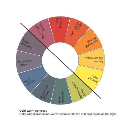
The cold-warm contrast relies on both subjective temperature sensations and spatial-geometric perceptions.
Various experiments have confirmed that we perceive the blue-green part of the spectrum as cold, while the yellow-red part is warm. For example, test subjects who stayed in rooms painted with such hues rated the temperature of blue-green as several degrees lower than that of yellow-red. This cold-warm contrast also exists between related colors. Cold-warm harmonies from components of one color tone, such as red-violet / blue-violet / cyan, have an intense, activating and moving effect. This color tension possesses a captivating quality, making it an ideal choice for subjects like sports and online shopping. In addition, the combination of such color values can also be used to emphatically create the spatial impression of a picture. Warm colors appear closer, cold ones further away. A landscape photo appears more spatial if there is a cold blue sky in the background. Cold colors are distant; calming, warm ones seem to be close and exciting. This near-far contrast is partly responsible for the color perspective. The cold-warm contrast usually occurs together with the light-dark contrast.

Main Lightness and Color
Previous Light-Dark contrast
If you found this post useful and want to support the continuation of my writing without intrusive advertising, please consider supporting. Your assistance goes towards helping make the content on this website even better. If you’d like to make a one-time ‘tip’ and buy me a coffee, I have a Ko-Fi page. Your support means a lot. Thank you!
 Since I started my first website in the year 2000, I’ve written and published ten books in the German language about photographing the amazing natural wonders of the American West, the details of our visual perception and its photography-related counterparts, and tried to shed some light on the immaterial concepts of quantum and chaos. Now all this material becomes freely accessible on this dedicated English website. I hope many of you find answers and inspiration there. My books are on