

You are here: Nature Science Photography – Lightness and color – The reproduction of lightness and color
Spontaneously, the first thing that comes to mind to fulfill these requirements is the visible spectrum of light, in which the colors can be described via the wavelength. Unfortunately, not all colors can be described by wavelengths, as we can capture the mixtures between blue and green and between green and red, but not those between blue and red. The latter do not occur in the visible spectrum, but they are nevertheless perceived by us. Furthermore, we have already discovered that different spectra can create the same color impression. Finally, it should be noted that the wavelength is not a suitable indicator of the different saturation levels of a color.
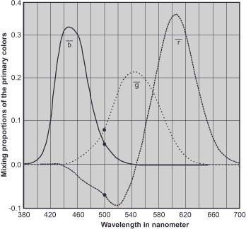
The only system that can do justice to this claim is our own color perception, and in 1931, the CIE (Commission Internationale de l’Eclairage/International Commission on Illumination) set out to define colors based on the human color perception apparatus. Simplified, experiments were carried out in which test persons had to try to mix a large number of given colors F under precisely defined light and viewing conditions by the correct combination of a blue, a green and a red light source. The scheme revealed that the three basic colors were the most effective.
R + G + B = F
It was possible to reproduce a large number of colors, but these were by no means all real colors. The missing colors could only be created if a trick was used, and the color to be mixed was changed with one of the basic colors. Rather than focusing all three primary colors on a single point, we mixed one of them with the specified fourth color, resulting in a negative brightness. The corresponding formula is, for example,
R + B = G + F or R + B - G = F
These RGB color matching functions allowed for the mixing of all perceptible colors from a purely mathematical perspective, giving rise to the CIE standard color system.
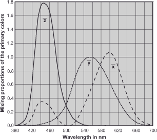
However, having to deal with negative values is neither particularly elegant nor especially descriptive, and mathematicians just like physicists love elegant solutions. For these reasons, the CIE pulled an ace out of its sleeves and created three new primary colors that avoided the unloved negative color components. That is, they thought up three, because physically the three new primary colors X, Y and Z
are not possible, but mathematically they are. They simply combined our three primary colors red, green and blue in the right measure to create something new. The virtual red would be calculated according to the formula
X = + 2.36460 R - 0.51515 G + 0.00520 B

would result in a kind of super red. For green

Y = - 0.89653 R + 1.42640 G - 0.01441 B

and the virtual blue is calculated according to the formula

Z = - 0.46807 R + 0.08875 G + 1.00921 B
Thus we can mathematically mix all real colors, even the spectrally purest ones, without having to use negative components. Now we are no longer dealing with real color values, but with a completely mathematical model, and the before mentioned diagram, revised according to these specifications, now looks as in figure 37.
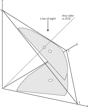
This is undoubtedly elegant from a mathematical point of view, but not yet clear to the average viewer. To get a reliable idea of the whole thing, we have to look at the X, Y and Z values from figure 37 (XYZ color matching functions) as axes in a three-dimensional space as shown in figure 38 (Three-dimensional XYZ space).
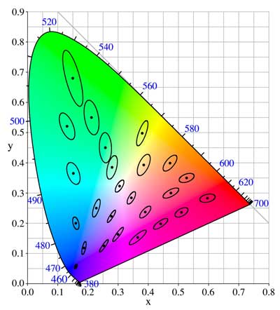
And it is even a little easier if we only look at a cross-section through this space, as it is offered to us by the CIE chromaticity diagram formulated in the CIE-xyY system, which is often affectionately called
horseshoe or shoe sole because of its shape.
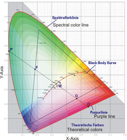
Mathematical transformation creates a two-dimensional space that captures all colors of the same brightness. The horizontal x-axis indicates the intensity of the red value, and the vertical y-axis is for the green value. The normalization of the data to a size of 1.0 eliminates the need for more, as the difference between the addition of the red and green values results in the missing blue part. As previously mentioned, this diagram does not display the Y-axis, which measures brightness. The highest saturation values of a color tone (the spectral colors) lie exactly on the edge of the diagram, which is therefore also called spectral color Line. White, gray or black are created at the point (white point, W) where the intensities of x and y are equal. In the scaling used here, it is 0.333. On each connecting line that we draw between the spectral color procession and the white point, the respective color does not change, but only its saturation increases from the inside to the outside. At the foot of the shoe sole, the
purple line is found as the connecting line between red and blue. The purple tones that don’t appear in the spectrum are located here. The black body curve marks the color values of the black body used for color temperature determination. Of course, the illustration is only schematic in nature, as it is impossible to represent all theoretically possible colors using current printing technology or on a screen.
The only disadvantage of this widely accepted system is that the geometric distances between two pairs of colors do not always correspond to our perceptual distance. In other words, two pairs of colors that have the same geometric distance often appear to us as different. We can graphically represent this by marking any color in the color space and then drawing other colors that have the same visual distance. This matching results in ellipses of different sizes, called MacAdam Ellipses after their discoverer. We had to mathematically transform the CIE standard chromaticity diagram into a new system to match the geometric color distances with the perceived ones. The distortion that transformed the MacAdam Ellipses into circles of approximately equal size gave rise to the CIE-LAB and CIE-LUV color models. We use the first to classify body colors, and the second to evaluate light colors in monitors and scanners.
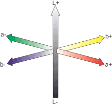
The Lab color model defines color using three channels (values): L for luminance (brightness), a for the color axis between red and green, and b for the color axis between yellow and blue. At the intersection of these axes are the achromatic colors. Therefore, the Lab model relies directly on the physiological properties of our perception (recalling Ewald Hering’s system of opponent colors) rather than physical measurements.
The Lab color model contains all colors perceivable by us humans and therefore naturally also has a larger spectrum than RGB or CMYK. Many graphics programs use Lab as a reference because it encompasses all potentially device-dependent color spectra, facilitating the conversion of color information from one color space to another.
In contrast to the RGB model, the Lab model separates the brightness from the color information. If RGB images are changed in brightness, the individual components that make up the color also change. The situation is different with Lab. Here, the information about chromaticity in the a- and b-channels remains untouched.
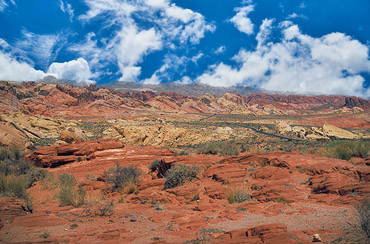
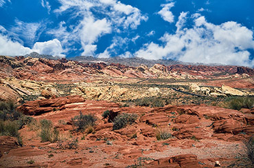
The connection between brightness/contrast and color saturation remains a problem, as any increase or decrease in contrast also affects the color saturation. Figures 42-45. … (contrast and color saturation)
illustrate this connection. Using an image manipulation program, if we select the „Luminance“ fill method for an adjustment layer, we observe a less pronounced change in the brightness channel of the Lab mode and a strong change in color saturation in the RGB mode compared to the unprocessed original image. This difference stems from the fact that contrast enhancement in RGB mode directly converts the pixel values of the three primary colors, red, green and blue, to higher, i.e., darker, values (and a darker red is a more saturated red), but the relationship in the Lab model is indirect. It comes like this: Lab divides the color information into the brightness part L* and the two parts of chromaticity (chromaticity) a* and b*, but the correlate of the color saturation corresponds to the result of the division chroma / brightness. A contrast increase in the brightness channel sets all pixels again to higher (darker) values, but as long as a* and b* remain the same, the result of the division changes. However, the effect is not as strong as it is in the RGB model.
Simon Tindemans (www.21stcenturyshoebox.com) has thankfully written a series of Photoshop actions (LuminanceCurve & LightnessCurve) and a plugin (Tonability), respectively, that serve to avoid the side effects of normal tone curves on color saturation. They convert pixel values from one lightness to another without changing the R:G:B ratio. On his website, he gives detailed instructions on how to integrate the tools into a Photoshop workflow. Anyway, as he quotes Adobe’s Thomas Knoll, the majority of users prefer the increase in color saturation associated with contrast enhancement. This is probably because our viewing habits are so influenced by the behavior of AgX image carriers, which, until the introduction of the most modern color couplers, were determined by the connection „contrast plus = color saturation plus“.
I understand what you might be thinking right now, and to echo Thomas Magnum’s response, you’re correct: I didn’t have to go through all that theory to explain color perception alone. In this way, we have acquired the necessary knowledge to cover the basics of digital color management in a single session. – We owe that much to the digital age, because who still gives their pictures to the printer untreated today?
The set of colors that can be represented in a color space is called the gamut.
Next Color Management – The Perception Algorithms of Machines
Main Lightness and Color
Previous RGB, CMYK – Description of impressions in device-dependent reference systems
If you found this post useful and want to support the continuation of my writing without intrusive advertising, please consider supporting. Your assistance goes towards helping make the content on this website even better. If you’d like to make a one-time ‘tip’ and buy me a coffee, I have a Ko-Fi page. Your support means a lot. Thank you!
 Since I started my first website in the year 2000, I’ve written and published ten books in the German language about photographing the amazing natural wonders of the American West, the details of our visual perception and its photography-related counterparts, and tried to shed some light on the immaterial concepts of quantum and chaos. Now all this material becomes freely accessible on this dedicated English website. I hope many of you find answers and inspiration there. My books are on