

You are here: Nature Science Photography – Lightness and color – The perception of lightness and color
Our visual system is able to compensate for variations in the spectral composition and color temperature of light over a wide range because natural lighting almost always contains a sufficiently large proportion of all spectral ranges. Under this condition, a corresponding inhibitory potential in one half of an opponent color channel matches an increased excitation in the other, maintaining an even balance.
However, when the sun is particularly low above the horizon in the morning and evening, we regularly experience moments when the balance tilts disproportionately to one side. Regardless of their color, all objects in direct light initially appear to have a slight reddish glow, which gradually shifts to a red-orange hue. One can particularly observe this on white house walls, which momentarily appear to have a vibrant red hue. The now-obsolete sodium vapor lamps, emitting light of only one wavelength, serve as another example of this phenomenon known as color change. In this light, an object loses almost all of its color.

We perceive pure white when a body remits all wavelengths evenly at 90 or 100% and the incident light contains all areas of the spectrum at the same time.
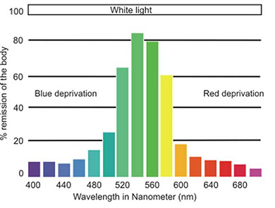
On the other hand, a body appears green to us if it absorbs the short- and long-wave partof the incident complete spectrum and only remits the medium-wave remainder.
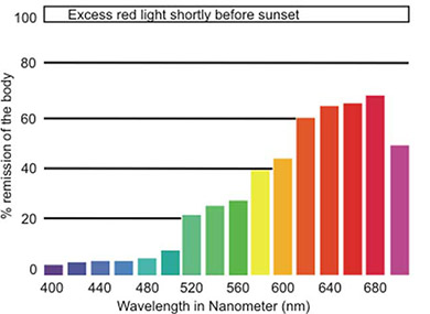
However, the same green body appears reddish to us if the incident spectrum no longer contains all wavelengths but is dominated by one spectral range, as in this case the low sun.
To understand what happens, let’s take a look at the remission curves in figures 23 a, b, c (wavelength and remission). They indicate the color stimulus that occurs when we relate the material-specific reflectance properties to the quality of the illumination. With the upper illustration, we feel our way to what is happening. It comes from an object that reflects all wavelength regions of the spectrum uniformly. Under an illumination that includes all wavelength ranges, we will perceive it as white. The middle figure shows an object that absorbs the short and long wavelength portions of the spectrum and remits only the medium wavelength portion. For this reason, it appears green to us under the previously used white illumination. With the help of the lower figure, we have reached our point. It shows the remission curve of the same green object that we observe this time under the red excess illumination shortly before sunset. Since the intensities of blue and green in the illumination are low in this case, despite the theoretically good remission of the green dye in this area, the contribution to the color stimulus is also modest. On the other hand, the intensity of red is high, so it dominates the amount of light reflected in absolute terms. Red and orange objects, of course, benefit particularly strongly from this circumstance because they reflect these regions of the spectrum anyway.
This dominance of the boring red part in the illumination and in the spectrum remitted by the objects also affects our color perception. Because the corrective of the inhibiting short- and medium-wavelength spectral range is missing, it causes an ever-increasing sum of exciting signals in the double opponent color cells of the red + / green – channel and the yellow + / blue – channel and to us, the light itself and the objects appear as more and more red-orange. Keep in mind, this phenomenon only impacts objects that receive direct illumination from the low sun. In the shadow areas, the colors are relatively unchanged because the light reflected from the sky is king, which is much less subject to the filter effect of the atmosphere. The color saturation increased by the flatter angle of illumination and that red glow slowly merge and eventually overlap, so that their effects are potentiated.
Our perception apparatus reacts to this constellation in two ways. First, because of the larger number of cone cells in the retina that are sensitive to the middle yellow and long-wave red range of the spectrum, it has a natural preference for orange and red tones (see „Our preference for warm colors„). Second, the greater color saturation associated with the flat angle of illumination, the less blended wavelength stimulus, causes a single one of these receptor types to respond comparatively violently. In summary, warm colors trigger a stronger neurological stimulus, resulting in a more intensely felt perception. The physiological consequence of this interaction explains why we experience our most intense moments in nature during the first and last hours of the day, and why we often reach for the camera during these times.
In anticipation of the following section „Color in Photography“, I cannot refrain from pointing out a little trick. Since color films and digital image carriers tuned to average daylight lack our corrective of color constancy, they produce the pleasantly warm impression all by themselves long before we perceive it. However, by employing a little self-trickery, we can extend the fleeting magical moment and capture a moment when image carriers tuned to medium daylight perceive the world more vividly than we do. Adjust your visual system to the cooler blue end of the spectrum an hour or an hour and a half before sunset by repeatedly looking at the shadow areas for a moment. If you look back at the yellow-red tones, they will take on the warm appearance of a color-saturated slide, at least for the moment when the color consistency needs to counteract. In this way, our senses are open soon enough to that exciting moment of the perfect blend of warm and cool hues that gives the image not only more drama but also more realism. – After all, a sunset alone is not particularly appealing. Only through the combination and the possibility of comparison with a piece from the other end of the spectrum, a piece of blue sea, a piece of sky, or even neutral gray rock, its effect becomes really strong and credible.
Next Fourth processing stage – Generation of impressions
Main Lightness and Color
Previous Third processing stage – Adding a spatial aspect for color
If you found this post useful and want to support the continuation of my writing without intrusive advertising, please consider supporting. Your assistance goes towards helping make the content on this website even better. If you’d like to make a one-time ‘tip’ and buy me a coffee, I have a Ko-Fi page. Your support means a lot. Thank you!
 Since I started my first website in the year 2000, I’ve written and published ten books in the German language about photographing the amazing natural wonders of the American West, the details of our visual perception and its photography-related counterparts, and tried to shed some light on the immaterial concepts of quantum and chaos. Now all this material becomes freely accessible on this dedicated English website. I hope many of you find answers and inspiration there. My books are on